11 of the Most Interesting Data Visualizations on Beer
I’m a statistics nerd and love working with data. It is one of the reasons I built BeerMaverick in the first place. I noticed that the massive amounts of data surrounding hops and beer yeast were scattered across the internet on various websites, forums and PDF analysis sheets. I spent months combing through hundreds of different strains of yeast and hundreds more different varieties of hops.
I’ve always been drawn to visualizing data in a way that makes data both easy to understand and read. Along my travels to the ends of the internet, I’ve come across some amazing charts, graphs and infographics relating to the data of beer. Here are fifteen of my most favorite.
Beer Styles by ABV & IBU
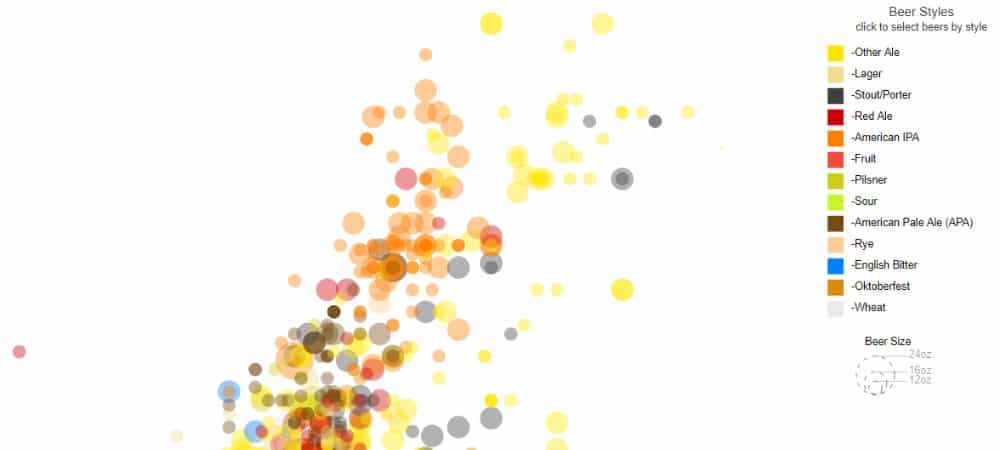
This interactive chart shows the correlation between IBUs and ABV by beer style. Nathan Harris grabbed a handful of popular beers and plotted each one’s bitterness and alcohol content, then color coded them by style. Some styles are a little light on samples, but overall it’s an extremely easy way to see how different beer styles tend to group together on the chart. View Chart
Most Popular Hop Combinations in IPAs
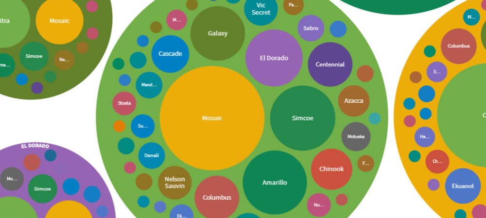
This chart shows the most common hop combinations from over 330 popular and recent IPAs. Its no secret that IPAs use an enormous amount of hops, and usually it extends into 3,4,5 different varieties. The possibilities are endless when you consider that there are over 125 hops that have citrus aromas and almost 50 that smell or taste like tropical fruit. As IPAs, and New England IPAs continue to push the envelope as to how much fruit flavor can be bottled in a beer, choosing the right varieties can be daunting. View Chart
Untappd Ratings by Style
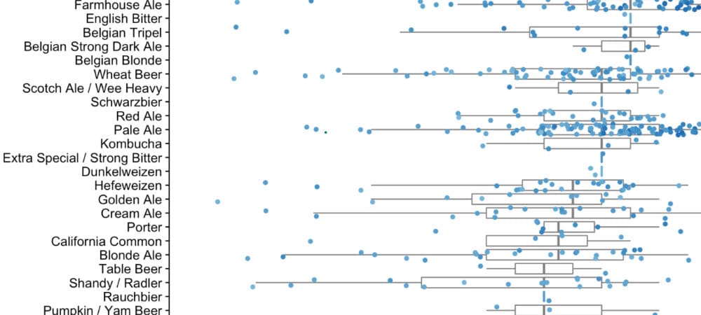
“A few beers later” is a mini site put together to see how three people (Bob, Alice and Carl) compare when rating beers on Untappd. A few of the charts show their preferences compared to all of Untappd as well. My favorite was to see how the ratings differed by style for the whole Untappd universe. Regardless how you feel about rating beers, the sheer amount of data that went into this does show the most popular beers on the market today. View Chart
Brewery Data in the USA
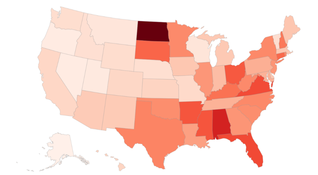
This chart is one of our own. We took the data from the Brewers Association “State of Craft Beer in 2020” packet and charted it on some US maps heatmap style. In this article, we see which states have the most breweries per capita, which states have the highest density of breweries, production levels, growth rate and more. View Chart
Grains: The Farm to Glass Process

We found this very informative infographic from BestMalz when putting together our article on the different types of 2-row malts. Never before did I see such a comprehensive diagram of how malt is grown, harvested, milled and finally brewed. This fascinating graphic will surely fill in any gaps you may have in your grain-to-glass knowledge. View Infographic (go to the end of the PDF)
The Price of a Beer by Country
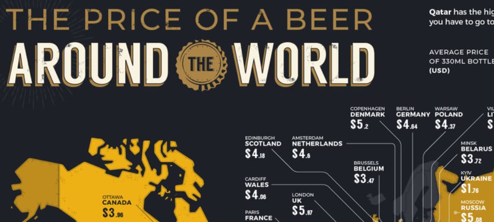
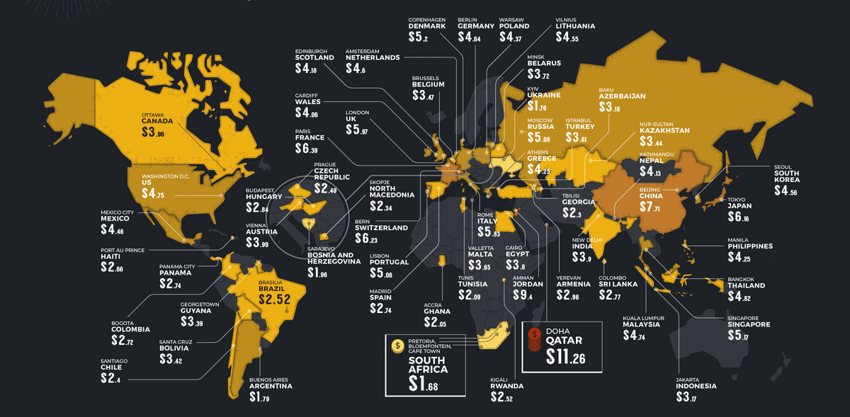
Expensivity recently put together their Wold Beer Index 2021 that delves into the cost and consumption of beer around the world. Some interesting tidbits they found: Germans spend the most on beer, Qatar has the most expensive beer, South Africa the least and the Czech Republic drinks the most. View Infographic
Hops & Their Data
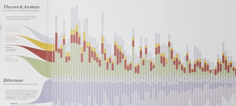
Hops Chart was previously featured on our 2020 holiday gift guide, but deserves a mention here as well. The article we linked to explains how the chart was conceptualized, iterated on, and finally provides a link to buy the printed chart if you so choose. Visit Chart
Choose The Perfect Craft Beer
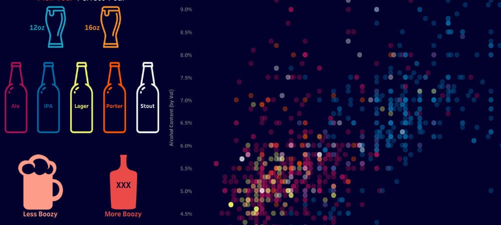
Zach Bowders created this interactive chart a couple years ago to help you choose the perfect beer for #InternationalBeerDay. Pick the style, booze level, hoppiness and let this chart give you the best craft beer that matches. Of course, the problem will be actually finding some of these beers, but that’s ha;f the fun… right? Visit Chart
Beer Yeast by Data Qualities
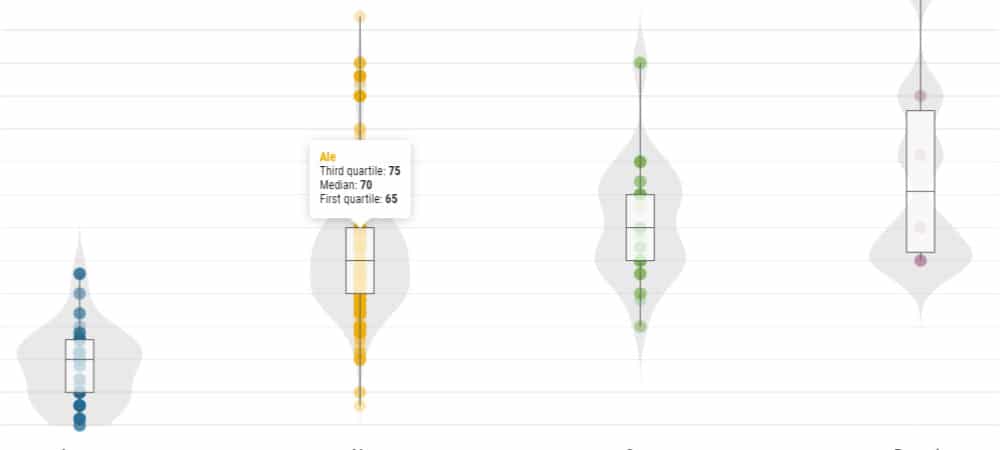
We recently created this set of charts depicting how different kinds of yeast behave during fermentation. We plotted over 340 Ale, Lager, Sour yeast (along with bacteria) and their max attenuation percentages, preferred temperature ranges and max ABV tolerances. View Chart
Beers by Style Infographic
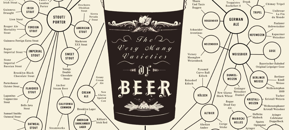
I need a large print of this hanging next to my bar downstairs. Not only beautiful, this graphic from Ben Gibson via Fast Company shows you how all the different beer styles are related, and give you some of the most popular examples of each. Unfortunately Ben’s site doesn’t exist anymore and the print link is not working either, but it’s an interesting infographic nonetheless. View Graphic
Craft Beer Boom
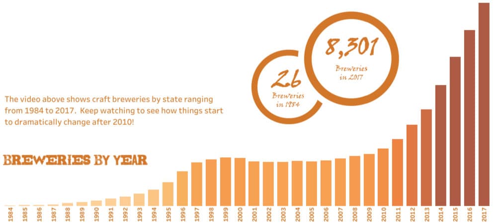
Kevin Flerlage created this massive interactive chart with Tableau in 2018. It plots and details the craft beer boom over the last three decades. Kevin is from Cincinnati and finishes the chart with a plug for Listermann Brewing, which we also enjoyed very much. View Chart
